

How to evaluate a display for photo editing before making a purchase, the future of display technologies, and a free tool you can use to test the color and illumination quality of your current display.
Some people are happy with off-brand specials at bargain prices, while others must have the best of the very best.
While most of us want the optimal combination of price and value, it’s hard to pin down the best balance of price, features and quality for each person’s needs.
For some shoppers, new color standards being put in place will drive big changes for future display purchases. This blog post reviews how to shop for new displays from the standpoint of where we are and where we’re going, so you can choose your next display with confidence.
The Current Offerings
Today’s digital artist has more display options than ever; what’s best for your current and future needs?
There are a few critical factors to consider when selecting a display.
- Evenness of illumination across the whole screen
- Range of color that can be displayed
- Consistency of color from top to bottom (and side to side)
As you’d expect, the better each of these factors is realized in a particular display, the higher the cost.
Sticker shock can be a problem here!
They cost HOW much??

A side note to these developments in display technology is that people are suddenly being surprised by the cost of a display.
A friend who is directly involved in setting specifications for what to buy at a major university notes that “We are seeing people working in critical environments who are having to justify prices for displays that haven’t been seen in a long time.”
A good reminder that quality actually costs money! How surprising!
I’m going to poke a little fun at photographers here, because I am one, and I’ve been guilty of the same mistake. Photographers will make their children go without shoes for six months, in order to have the latest and greatest piece of glass to hang on the front of their lens.
Like many of you, I know that my photographic images would improve dramatically if I were to buy the new (fill in the name of your current lens obsession), in my case the Nikon 200–400 mm ƒ/4 zoom, shown below. I’m sure the sales of my images would take a quantum leap upward with this lens!

Unfortunately, at roughly $7,000, I’m unlikely to invest soon, but many photographers will buy a great lens and a poor display. Why would they do this?
Well, once photographers acquire this expensive glass to look through for only fractions of a minute at a time, their children still have no shoes. So, photographers economize on the display that they’re going to look at for hours at a time while editing, too often purchasing something made out of recycled soda bottle glass. This is a BAD idea.
Economizing on display quality is a recipe for eyestrain and editing disaster rolled into one, so it’s important to choose a model that will deliver adequate quality and comfort.
Things to Analyze When Buying a Display

Let’s look at how to pick the best display you can afford.
First, and most important, realize you’re investing for your health and wellbeing, not just for a quick solution to finding a display. Thus, you’ll need to have a budget equal to the need.
Gamuts and Technologies

The range of color a display can show you is called its gamut.
Gamut sizes range widely. You can see in the gamut maps shown below the difference between an inexpensive display with a small gamut, and a state of the art display with a significantly bigger gamut.
How do you decide how much is enough?

At a minimum, it’s good to have a display that can show you the full range of sRGB – a color gamut designed for consumer cameras, office printers and displays.
I say at a minimum because many of the printers used to print images on Breathing Color substrates can print shades of color outside the gamut of sRGB, and given a choice, it would be better to have a display that can show you all the colors you’re going to be able to print.
If you shoot with a camera that only offers sRGB or some subset of this color, no problem.
Your camera hasn’t captured any more color than you can display, and you won’t have any more color to print than you captured. You can’t put it back in after acquiring with a limited gamut.
You’ll still want a display that is consistent quality from side to side and top to bottom, and if you plan to upgrade cameras anytime soon, to shoot in Camera RAW or Adobe RGB, you may wish to buy a bigger gamut display to accommodate your upcoming changes.
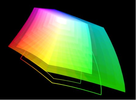
The 3D graphic above shows a comparison between sRGB and AdobeRGB; there are some very nice shades of colors that can be printed on many Breathing Color papers if you capture them in a wider gamut than sRGB and preserve them in your editing process.
If your current camera offers settings to shoot in bigger color spaces, such as Camera RAW or in AdobeRGB, you would benefit from a display showing more than sRGB. How do you find out which ones offer a bigger color gamut?
Fortunately, this is an item companies will brag about if their products have it, so look for specifications such as 97% of Adobe RGB, 99% of AdobeRGB, etc. This means that displays showing only sRGB should be considered adequate for some workflows, but are not exemplary choices for serious photographers.
Bit Depth: Why Should You Care?
Bit depth numbers tell us how many shades of color a display can show us.
The best displays currently shipping can display more than 8-bit color, the common standard for most displays. 10-bit color seems to be the current standard for excellence in higher-end displays.
Why bother with this? Turns out Photoshop and some other programs can work in a higher bit depth than 8-bit, making blends and transitions smoother, both on screen and in calculating operations. Working in higher bit depth and seeing better bit depth on-screen will work hand in hand for better quality workflows.
Drilling Down Deep on Bit Depth Numbers
Although Photoshop’s default is 8-bit color, it can work in higher bit depths for calculating, and was recently updated to work with 10-bit displays, as were parts of Apple’s Mac OS El Capitan.
If you’re working with subtle gradients and blends of colors, working in a higher bit depth for editing is a great idea, and being able to see all of the color you’re editing is an even better idea.

In case you’re wondering, here’s how the numbers work in bit depth.
Each of your image’s channels (red, green, blue) has a certain number of shades available between pure white and pure black. In 8-bit color, each of the three channels in an RGB image has 256 steps from pure white to pure black. 256 is 2 raised to the 8th power (28).
Multiplying the three channels together, (2563), shows you can have 16,777,216 shades of display color. This is a big number, but it’s not big enough for the best shading and blending sometimes.
So, some manufacturers make 10-bit displays, giving 1.07 billion shades of color. Wow! This is 64 times more shades, or, to put it another way, 8-bit color shows you only 1.5% (yep, one point five percent) of the shades of color 10-bit color can show you.
This is more than your unaided eye can see, but the important thing to note is that you’ll be able to see subtle transitions correctly when you need to see them.

To get this level of color, you’ll need a 10-bit display, using applications that support 10-bit color configured correctly(such as Photoshop’s newly upgraded capability), and a video card that connects using 10-bit signals.
Right now, that mostly means connecting the display using a DisplayPort connector on your video card; if your computer doesn’t have DisplayPort, it’s unlikely to be able to give you this level of color. The applications you’re using must support 10-bit color, and while this number is growing, it’s by no means universal yet. All the pieces must be in sync for you to take advantage of this color quality.
Uniformity of Color and Illumination
When judging the quality of both color and exposure on one of your images, it’s essential to be able to trust the display you’re using.
You need both the color and the illumination to be consistent from top to bottom, side to side and diagonally from top corner left to bottom corner right. High-end manufacturers go to great lengths to ensure this level of consistency. Some manufacturers even calibrate each display individually.
You should be aware of that one of the ways that less expensive displays can be manufactured is that the manufacturer buys display panels that have been rejected by the high-end manufacturers, because these panels have less evenness and less faithful or consistent color.
By lowering their standards, they can lower the price they charge you. This means that you’re usually ending up with a display that will be wildly brighter or darker in different spots on the screen, or have very different color in different parts of the screen.

A Color Quality Test
Fortunately, there’s a quick and easy way to test for this. Accompanying this blog post is a PDF that you can download to use as a quick and easy test for color display quality. Download the PDF, and open it on your display.
Next, in whatever program you use to open the PDF, be sure to hide as many panels, windows and controls as possible, so you’re seeing only the PDF. Turn off all of the other lights in the room and view the full screen gray image carefully to judge whether or not you see areas of your display with inconsistencies in brightness or color in different parts of the screen.
If part of the screen blooms in magenta, or yellow, or other colors, or is noticeably different in brightness, this color will skew your color judging abilities.
If you do see inconsistencies, you have some serious decisions to consider as to whether or not you’re going to keep this display, or trade up to something that will be both easier on your eyes and deliver better quality in your image editing and design work.
Do You Need Built-In Color Management Tools?
One of the decisions to make when buying a new display is whether or not you need to have the integrated color management that some systems offer.

In this image, you can see an automated arm that pops up out of the beveled edge of the display, automatically calibrating and profiling the display to ensure consistent color.
Based on your specific needs, routines can be preprogrammed so that the auto-calibration and profiling happen when the user is not at the desk, for example at three in the morning (when we hope you’re not at your desk!). This potential for automation means that all the screens in a workflow can be synchronized to the same color space and illumination standards automatically, maintained that way without any human intervention once they’re set up and configured.
That’s the argument in favor of integrated color management systems; what’s not to like about it? Well, if you’ve already invested in color management gear, or you have other displays, projectors, laptops, or iMacs to calibrate, you may wish to use your external color management tools for all the displays in your workflow.
This is a judgment call you have to make, and it will depend on how many of each kind of display you have or want to have, how much time you have to be doing manual color management calibration and profiling, and what your budget will allow.
The only argument that doesn’t play here is the one that says: color management is too expensive to do. It should be obvious at this point that the most expensive form of color management is not doing it all, guaranteed to cost you money, over and over, until it hurts so much not to do it that you finally breakdown and invest in the tools and the time to master your color.
How Big is Enough: Is Bigger Always Better?

For quite a while, it was everyone’s dream to have a 30 or 32-inch display on their desks.
Such giant expanses of glass were used to send a signal that this person is a Very Serious Photographer/Designer, with a massive amount of screen real estate to work on. Two problems surfaced on larger displays right away. The first was that they’re expensive. A 30- or 32-inch display costs a great deal more to manufacture than smaller displays, much more so than the added square inches would seem to indicate.
Next, it becomes progressively more difficult to assure evenness of illumination from side to side, top to bottom and corner to diagonal corner as screen sizes grow. So, quality consistency can suffer. Although manufacturers still offer these huge displays, it’s much more common to see 24 and 27-inch displays purchased at significantly more affordable prices.
You can see in the graphic above that while a 27 inch display offers a bit more on the sides, good for palettes, perhaps, the additional space given by the 30 inch display around the edges may not be particularly useful in everyone’s workflow.
When selecting a new display, it’s better to buy a smaller display of higher-quality such as a 21” or 24” inch display, than to buy a bigger display such as a 27” or 30” inch display whose quality is not as good as the smaller display. Invest wisely in order to get the best results with the least amount of money.
Finally, some users of 30- and 32-inch displays discovered they were getting serious issues with repetitive stress injuries (RSI), as the distance to travel between the icons in the dock at the bottom of the screen, the menus at the top of the screen and the controls on the side of the screen were such long distances that carpal tunnel syndrome was exacerbated in some users. This is another consideration for working smarter, not harder, on a smaller display.
Do You Need a Display That Can Be Rotated?

One of the features desired by some users is the ability to rotate their displays to pivot to a vertical position (also called portrait orientation), as opposed to the horizontal (landscape) orientation that most people use their display.
If you always work on vertical images, you may find you’re only using the center of the display for your work, if it’s kept in its landscape orientation. Therefore, some people make a point of buying a display that rotates on its stand so they can switch from landscape to portrait orientation quickly.
If you think your workflow would benefit from having a display that can be rotated, you have two options.

The first is to buy a display that has a rotating stand built in. This is an easy feature to check, looking in the specifications for a listing usually shown as Pivot: 90° (or more). This is distinguished from the other adjustments shown in the graphic above, many of them good choices as well.
The second is to buy a display that can be attached to a mounting arm, which will let you rotate the display. These displays will have a VESA adapter on the back. The VESA stands for Video Electronics Standards Association. They’ve defined standards for mounting displays to arms and to walls. Buy an arm that will attach to your display and let you rotate the display orientation without needing rotation to be built in.
This arm will also be useful for adjusting the display to the correct ergonomic height, and can be used to keep your display off your desktop, making more room on your work table.
Only you can decide if this is of sufficient value to make it a key factor in your decision-making process, but I’m a big proponent of vertical displays and mounting arms, so I encourage you to consider both carefully.
Touch Support
Some manufacturers have added on-screen touch support to their displays. For example, Wacom, the company known for making stylus-operated tablets, has recently created several new high-end displays for color critical workflows, with stylus support directly on the display.
In addition to stylus technology, Wacom has added touch technology to these displays. Opinion is divided on how useful this can be on a high-end display.
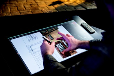
I was paid to write about and extensively test these new Wacom Cintiq® Touch displays, and yet I found that I prefer to leave the touch technology turned off. I don’t want to be judging high-end images through a film of fingerprint oils or related grime that will build up over time. This is a personal preference, and there are people who find that using a touch screen is immensely more productive.
Depending on the operating system you use, touch is more or less integral to the operating system’s functioning. If you have an opportunity to test touch functions on a sample display before buying it, this is strongly recommended. You may find it very useful, or you may find, as I did, that it’s a feature for which I’m unwilling to pay extra money.
Stylus Support
Full disclosure: Wacom, the market leader in stylus technology, has hired me to write about their products on more than one occasion. I’m happy to do so, and happy to recommend their technology, because I’m a firm believer that it helps me produce better images in less time. As Julieanne Kost of Adobe famously says, “trying to do precise work in Photoshop with a mouse is like trying to do fine art sketching with a bar of soap.”
I can’t imagine trying to produce the volume and quality of work that I do with a mouse, when it is so much more efficiently done, as well as more accurately done with a stylus. The question you have to ask yourself is whether or not you need that stylus to work directly on the screen, or would be happy simply using it attached to your computer.
I use both, I like both, but given the choice, I’ll always choose working directly on the glass with the stylus because I’m faster with it, much more precise, and I get more done.

There’s too much to do in life to spend any more time than needed doing essential tasks when I can find a tool that lets me do it both quicker and better simultaneously. Whether or not you need stylus support built directly into the display, I can’t tell you.
I can tell you that my testing shows that the latest Wacom Cintiq 27 inch displays, and the 24 inch Touch model before it, each ¬¬have both an extended gamut and consistent quality that allow me to do critical color work all day long and make me more productive.
Lightness of Being; Who Needs a Supernova on Their Desk?
One specification that gets more attention than it should is the total brightness of the display. This is often expressed using a rating system called candelas per meter squared, usually written cd/m2. Use this number cautiously when comparing specifications of different displays.
The funny thing about this number is that while certain manufacturers are racing to make displays that have high number ratings here, in most serious environments you should be using the display set a much lower brightness than the top-rated output. There are international standards that specify, for example, that you should have no more than 120 cd/m2, in both your display and in a viewing booth next to your desk, so that the screen and the print will match. So don’t let your head be turned by a pretty number for a display!
Sitting in front of a display that’s blasting out of thousand candelas of light at you would be much brighter than you should ever be working, unless you’re trying to use your display to get a tan.

If you feel you need some headroom, by all means get a higher number, but it’s no accident that many of the best displays currently shipping offer a maximum of 300–340 cd/m2 or less—and those manufacturers never expect you to use them at full brightness.
It wouldn’t be any fun to sit in front of a screen that’s giving you a sunburn or the potential for funny looking kids, now would it?
All kidding aside, an important reason for running a display at less than its rated brightness is that this will extend the usable life of the display. Running a 330 cd/m2 display at 120 not only matches certain recommended standards, but makes your investment last longer. Sounds like a win all around, no?
Pushing for Greatness: What’s Out There Now, and What’s Coming
Much of the excitement when looking at the future of choosing a display for photo editing has to do with the fact that decades after the print world, including photographers, widely embraced using the ICC color standard, it now looks as if modern video workflows will be color managed using the similar techniques and can be matched to the same types of standards. This is a new and exciting development.
For decades, the method used to balance a color display for editing video was one that had been invented before the first commercial television was ever sold, and depended entirely on the set of eyes of the person who is using the video monitor in front of them. It was always surprising the color matched as well as it did.

Now, with tools to impose consistency across a whole bank of displays, and coordinate with color being edited it in different locations, new standards of quality and new possibilities for quality are emerging.This is shown in new attention being paid to upcoming display technologies and specifically, what color gamuts can be viewed now, and what’s coming down the road.
The Displays of What’s Happening Now
The smart editor, whether photographer or videographer, is using their softwares’ color preview tools on a profiled display to see in software how their work will reproduce, using ICC profiles for each destination. This means selecting a display with a gamut that matches your needs. Let’s look at the gamuts current and future displays offer.
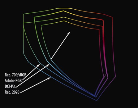
As noted previously, manufacturers of higher-end displays specify what percentage of various gamuts can be displayed on their products. While a photographer may be most interested in whether or not a display can show the full range of AdobeRGB, someone editing video is more interested in a standard called DCI-P3. You can see by the gamut map shown below that the P3 gamut (the second tallest outline) is significantly bigger than Rec. 709/sRGB, the small gamut in the center.
P3 is the standard for digital projectors being used when you go to see a movie now. Someone editing video wants to be able to see everything that you’re going to be able to see in the theater. It’s no accident that Apple just released new iMacs with an expanded gamut, which they proudly proclaimed matches the P3 gamut.
Current standards for editing video say that a DVD or Blu-Ray disc must be able to display sRGB/Rec. 709 color. A digital projector in a theater displays color in P3, hence Apple’s interest due to their current focus on videography. A future standard is coming quickly, though, that you need to know.
For still photographers, the P3 gamut may be less useful than a display that can show most or 100% of AdobeRGB. Regardless of display, it’s essential that you calibrate and profile your display so that you can accurately preview onscreen how your image will print. Remember that Breathing Color provides profiles of all their papers free of charge to download from this website.
That being said, for editing photos before previewing and printing, I recommend you calibrate and profile your new iMac display, then work in a color space designed for a photo workflow (Adobe RGB, sRGB, ProPhoto RGB), not a projection workflow (DCI-P3).
When you look at the outline of the P3 gamut, look next at the biggest gamut around it. That’s what’s coming next, shown below, with sRGB the smallest, then P3, then Rec 2020.

What’s Coming (On the Horizon)
The specification for the next round of televisions, ultra high-density television (UHDTV) says that the color gamut these displays need to show is supposed to match a standard called Rec. 2020. Rec. 2020 is the biggest outline on the map above. The first few televisions and displays that can fully show this huge gamut are just coming to market, and it’s going to take some time to be widely available, but these displays will come, with the bigger gamut.
Allowing people to edit Rec. 2020 standards on their desktop will be the logical next extension of this standard; being able to preview on creation workstations how the color will appear on final destinations is a hallmark of truly professional workflows, so rising demand and sales of UHDTV televisions will drive expansion of gamuts to desktop displays.

Printing will not keep up with this gamut expansion in the immediate future; you will still be looking at RGB color spaces that are much bigger than can be printed in their entirety on inkjet printers. While we wait and hope for breakthroughs in the print world to expand printable gamuts, you can prepare for this by editing in larger gamuts, preserving all the color possible in each image.
This means that when we can print our images on devices that will print larger gamuts, we won’t have to go back to our RAW files and re-edit them. Wise photographers will work in the largest color space available, secure in the knowledge that while they may not be able to print all the colors in their images today, things will improve, either incrementally or dramatically in the future. I plan to be ready; won’t you join me?
How to Choose The Display for Photo Editing That’s Right for You

In the best of all possible worlds, we’d all have giant screens, so we could see our work at 100% of final print size. The screens would use a tiny amount of power, cost next to nothing, display the entire range of colors of the human eye can see, and we would avoid carpal tunnel syndrome by thinking at the screen to move our mouse or stylus.
Now that I’ve indulged in fantasy for a moment, let’s look at the trade-offs.
If you have a choice between a high-quality display that is smaller, and a larger display that is not as high quality, choose the smaller display with better quality. You can always zoom in, but you can’t make up for unevenness of illumination or splotchy color.

Budget considerations play a significant role in our decisions, but it’s important to think of this is a serious investment in a professional tool, rather than an area to economize. Balanced choices can be made to get a very good display, without breaking the bank entirely. However, professional caliber displays are not going to be purchased for $99 on special in a weekend flyer in the newspaper.
You may get lucky—but you may have a better chance of winning the lottery then getting a bargain panel with consistent quality from side to side and top to bottom at this price point.
Here are some displays that I’m currently recommending to clients and colleagues. This list is by no means exhaustive, but each one I have used myself and am comfortable recommending them.
- Eizo ColorEdge CG series (24”, 27”)
- Eizo CX series (this series has a built-in sensor that calibrates, but doesn’t profile; you have to do that part)
- Eizo CS 270
- Eizo CS240 (not CS230)
- NEC PA MultiSync series with (optional) SpectraView II; 24, 27, 30 inch displays available, with or without color management software and hardware kits.
- Wacom Cintiq 27QHD and 27QHD Touch
- Wacom Cintiq 24 Touch (discontinued)
Other displays may deliver equally good results, but I haven’t tested them personally, and you will have to use the checklist in this article to review possible displays and balance your budget against your workflow needs and requirements for quality.
If the opportunity is available, viewing test files to see a display’s picture quality in advance of purchasing it is a really good idea. Test driving a display at a high-end camera store or computer store is a great way to make sure the display fits your needs. Sadly, these stores are dwindling in number, hard-pressed to compete with online sellers. They’re a valuable resource we need to support, even when they charge a bit more than online prices.
Conclusion

I know it seems like a lot to think about when shopping for a display for photo editing, but it’s important to note that most people will spend more time sitting in front of their display driving good-quality color images than they will sitting in their cars.
So, it seems to me that we should invest time in researching quality displays, just as as we would research our next vehicle purchases.
It’s important to buy something to protect the health of our eyeballs, give us the best possible results, with the most pleasant working experience. What we save by buying a bargain display now could have a good chance of being spent with ophthalmologists in the future.

Kevin O’Connor helps design and test software, is a graphic designer and photographer for multiple clients and companies, and fixes people’s (and companies’) color.
He has consulted to multiple companies, including Apple, Sony, Fujifilm USA, and X-Rite. He loves teaching good color practices to enthusiastic learners.
