

Part two of our in-depth guide to digital printing – color gamut comparisons of ICC profiles and an exclusive video lesson.
“Art is not what you see, but what you make others see.”– Edgar Degas
In part one of this series on digital printing, we defined what a chromogenic print is, set straight some of the misinformation and confusing terminology surrounding lab prints, and covered the pros and cons of inkjet prints and c-prints including differences in cost, quality, production speed, museum acceptance and more.
Now, let’s take a look at differences in color output between these two popular printing technologies.
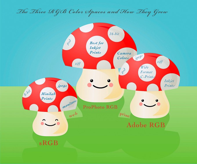
How the Colors Stack Up: Gamut Comparisons of ICC Printer Profiles
In order to make the best printer/paper choice for your particular image’s colors and subject matter, output color gamut needs to be taken into consideration.
Just like print longevity claims, exaggerated assertions run wild when it comes to color gamut coverage professed by OEM printer/paper manufacturers, photo labs and custom print establishments alike. This holds true whether these print businesses produce C-prints or inkjet pigment prints.

In doing research over the last six months, I’ve personally phoned technical support at more than 35 different commercial photo labs/print studios (some well-known, some custom), inquiring about ICC printer/paper profiles for soft proofing images.
I asked which RGB color working space best approximated the gamut of their profiles on a wide variety of printers (chromogenic or inkjet) and papers. As we know when it comes to making prints, the largest possible gamut is preferable to capture all the colors in your images or artwork. In this case, bigger is better.
Most photo labs stated that their profiles for various chromogenic printers on Fuji Crystal Archive papers cover most of the Adobe RGB color space – certainly more than sRGB – but scientific analysis proves this wrong as we will see. Some claimed their digital C-print profiles were as good or better than any commercial inkjet pigment printer profile available (not possible). Or that no inkjet pigment printer profile could exceed the gamut of Adobe RGB anyway.
This is untrue, and shame on them for not knowing this and misleading customers to make a sale.
When asked, others told me their profiles are custom made by color specialists and are kept up-to- date. In other words, they are remade often for best practices. I specifically asked whether they used generic profiles provided by OEM printer/paper manufacturers and was told no.
Not surprisingly, not one company’s statements were accurate. In fact, I was told these matters were best left up to “professionals” and that I would not understand.

How do I know these things?
Because I generated plots of those profiles in ColorThink Pro 3.0.3 software by CHROMix and analyzed them.
This very useful software is a complete toolset for managing, repairing, evaluating and graphing ICC profiles. It also allows you to analyze colors in your images to determine what printer/paper combination may work best when making prints.
By downloading ICC output profiles directly from commercial lab websites, I was able to generate ColorThink Pro gamut comparison plots. The resulting 3-D graphs compare the profiles with sRGB, Adobe RGB, and inkjet pigment printer/paper profiles. As readers know, these profiles are freely provided to customers for soft proofing purposes.
The results speak for themselves as the video and plots below will demonstrate.
Using ColorThink Pro and its Profile Inspector feature, we can not only generate 3-D graphs comparing multiple profiles, but also discover when the profile was created and with what device (hardware and software). When you open a profile in ColorThink Pro, all of this information and more is readily available.
So if a photo lab tells me they have custom profiles made and that they are up-to-date, I can verify those claims in the software.
The results were truly shocking to me.
I discovered very old, paleozoic profiles that dated as far back as 2005; canned profiles obtained from the OEM printer/paper manufacturer instead of being custom made as claimed; profiles with gamuts so small they easily fit into the sRGB color space; and profiles made with antiquated devices and software (think Monaco).

Readers on this blog all know that custom ICC printer/paper profiles are always best for optimal results. And that you shouldn’t be using any profile, generic or custom, more than ten years later, or until your printer meets its maker. Now that’s what I call a true R.I.P. so to speak!
Let’s take a look at a couple examples of how to use this software to your advantage as a printmaker.
Exclusive Video Lesson
To explore the examples I’ve chosen to illustrate these points, you have the choice of reading on, or watching the accompanying video I’ve made.
I recommend the video if you have the time – seeing the visuals is really helpful in understanding this stuff.
Before we get into specific examples, let’s first back up a bit and discuss some terminology.
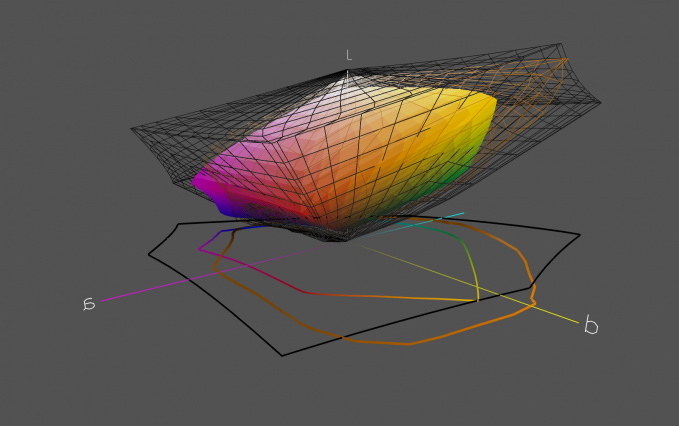
Most likely readers are familiar with the CIE L*a*b* color model (Lab for short), a device independent color space. CIE is an abbreviation for the French words for the International Commission on Illumination, which designed this space to reflect the gamut of colors the human eye can typically perceive, although it encompasses the entire spectrum.
It is often used as an intermediary space when converting colors.
The L component represents the lightness axis, ranging from 0 (black) to 100 (white). The a component is the red/green axis (+a is red, -a is green) The b component is the blue/yellow axis (+b is yellow, -b is blue). Although the [a] and [b] axes can theoretically extend as far as needed, in practice they are usually limited to 256 points (-128 to +127).
Example #1
Let’s take a quick look at the profile used by a photo lab for their Fujifilm Frontier minilab and Fuji Crystal Archive (FCA) Pearl paper. The L*a*b* gamut comparison plot below shows the sRGB color space (black wireframe on top/solid black ring on bottom) versus the ICC profile for FCA Pearl paper (inner colored cube on top/colored ring on bottom).

As you can clearly see, the gamut of the Fuji printer/paper profile is much smaller than that of sRGB, especially in the regions representing lighter values at the top. Despite the claims of this lab, the gamut is smaller than that of a typical consumer display.
Certainly not optimal for a print. Upon further examination, I discovered this profile was made back in 2008 by Fujifilm, so it was quite old and generic. Most assuredly, this minilab has seen a lot of use over the years and could benefit from a new custom profile.
Example #2
Let’s now compare an inkjet pigment printer profile with that of a chromogenic printer. This graph compares the gamuts of the following: Adobe RGB (black wireframe on top/solid black ring on bottom); an Epson 7900 printer profile for Ilford Smooth Gloss paper (orange wireframe on top/solid orange ring on bottom); and a Polie HD C-Printer profile for Fuji Crystal Archive (FCA) Glossy paper (inner colored cube on top/colored ring on bottom).
Please note the Epson 7900 profile was graciously provided to me courtesy of color specialist and master profile maker Paul A. DuPont of Greenleaf Color in Los Angeles. I am most grateful for Paul’s generosity in sending me these custom, high quality profiles. The C-print profile was downloaded directly from the website of the custom lab with the Polie.
You can see that in the very saturated regions of magentas/cyans, the Polie profile excels, but is otherwise eclipsed by both Adobe RGB and Paul DuPont’s profile for Ilford Smooth Gloss on the Epson 7900, which also protrudes well beyond Adobe RGB in several regions.
Note that analysis of the Canon 6400 printer profile for the same Ilford paper, also provided by Paul DuPont, showed greater coverage in the same saturated magentas/cyans than the Epson 7900. This is a well known difference between the two brands due to specific ink formulations. However, the Epson x900 series excels in the oranges, yellows and reds compared to the Canon.
Please watch the video posted above for more detailed comparisons, a full analysis, and additional examples.
Next: Part Three

The guys at BC send out a friendly email once or twice a week when new content is released, so that’s the best way to be the first to know when they publish part three of this guide to digital printing.
When part three has been released, this section will be updated with the link to it.

Renée Besta is a fine art photographer and printer, digital imaging and graphics instructor, graphic designer, and exhibit producer who has been avidly engaged in the art form for over 35 years.
