

How to print HDR photographs will cover monitor calibration and post processing techniques for printing HDR giclee’s.
There are a ton of HDR tutorials on the internet. There are very few that frame them through the lens of printing. Here is part two of a three part series from Renee Besta on HDR and printing. A start to finish encyclopedic tutorial on how to print great HDR photographs.
This three part series on HDR Photography is incredibly thorough. If you’d prefer to download them all in a single document for viewing later or printing at home, we offer this material in a .PDF E-Book.
In Part 1, Renée discussed how to use camera settings and color management to capture great HDR photos. In this piece, she talks about how to calibrate your monitor and utilize post-processing for optimal results.
Calibrate and Profile Your Monitor
Since your image editing decisions are based solely on what you see on your monitor, it is very important to both calibrate and profile your display. Yes, those are two different processes. The term ‘calibrate your monitor’ is often bantered about, with nary a mention of profiling. Calibration is the first step and sets the hardware of your display to behave in an optimal state based upon a group of standards. This means setting the proper white point (the color or temperature of the reference or target white), white luminance (how bright the white is), gamma (a curve that corrects for the eye’s non-linear response to light), and more. The second step is to profile your monitor. Profiling characterizes how accurately your monitor displays colors, then applies corrections (an ICC profile) to compensate for inaccuracies. This is done by flashing a set of color patches on the screen and taking measurements with a device such as a colorimeter or spectrophotometer. Comparisons are then made between the measured values and known color references.
Many people think this is just too much trouble, so they skip these vital steps. I would ask how much ink and paper they waste trying to get good prints. With today’s variety of excellent, well-priced devices, there is just no excuse to forego these important steps. I personally use X-Rite Photo’s ColorMunki Photo device (a spectrophotometer), which calibrates and profiles my monitor, printer, projector, laptop, and more. Since I make my own custom ICC profiles for printing (more on these later), this device has become one of my best friends. If you don’t intend to make your own custom profiles for printing, X-Rite now makes a less expensive ColorMunki Display device for profiling your monitor, projector, and laptop. There are many options out there, so check reviews online. I calibrate and profile my display once a week in case of drift.
Keep in mind that one of the most common problems photographers encounter when printing is that their prints come out too dark. The reasons are simple: their displays are set too bright and/or they are working in a room that is too dimly lit. Today most monitors are factory set at near maximum brightness levels, and may need to be dimmed by as much as half. The fact is that most consumers love to view bright screens in showrooms and find them pleasing due to their high contrast. However, very bright monitors do not accurately display colors. If your editing decisions are based upon viewing images at high brightness levels, your images will most likely come out dark with color inaccuracies.
Since your profiling device manufacturer will provide you with detailed information on how to profile your display, I will review the best settings to use for calibrating your display, which is the first step:
- Set the white point (color temperature) for D65 (6500 degrees K or Kelvin), which appears to the eye as a cooler, more bluish white. The older standard of D50 (5000 degrees K) used by pre-press professionals is way too warm a temperature for most people to accurately edit images in. These are simply standards developed by the CIE (International Commission on Illumination – the ‘E’ is for the French name). The color temperature illustration below demonstrates this concept of warmth to coolness (from the 1931 CIE color space chromaticity diagram with wavelengths in nanometers):

- Set your gamma to 2.2. This has long-since been the standard for Windows; however, Macs used to use a gamma of 1.8. With changes in the operating system, the standard is now 2.2 for Macs as well. Gamma is simply the nonlinear relationship between the monitor’s input voltage and the perceived intensity of light it emits. It affects midtones and is important because the human eye responds to light in a nonlinear fashion.
- Set the brightness (luminosity) of your display to 100-120 candelas per square meter (cd/m^2). It is best to work in a room with subdued light, with window shades closed and no bright lights shining directly on the monitor. While you don’t want to work in a dungeon, do not situate your workstation directly in front of a window. Avoid fluorescent and tungsten lights, as these will throw off nasty color casts. I work with an Ott-Lite TrueColor task lamp near my monitor, which is balanced for daylight. Other brands include SoLux and Sol-Source. Consider investing in a monitor hood to reduce stray light, or make your own from cardboard or plastic.
- There is a good reason designers work in rooms with neutral colors and don’t have loud wallpapers on their monitor desktops. When surrounded by loud colors, your eyes will be influenced when editing images. I use a medium gray background color on my display when editing.
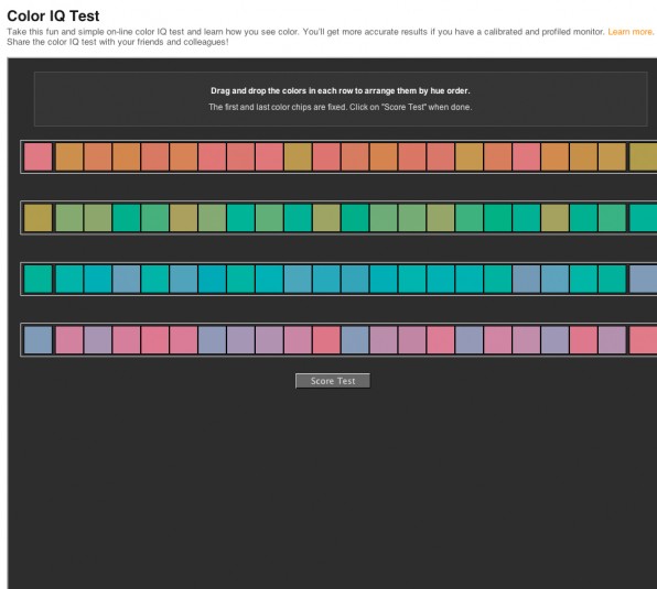
Have you ever wondered what your color IQ is? There is a really cool and useful tool by X-Rite that will help determine how you see colors and how well your monitor is calibrated and profiled. You can find it free on their website here. This is a wonderful test that will score you on the ability to arrange patches of colors in the proper hue order. This test works best on properly calibrated and profiled monitors, so take a look. I am proud to say I scored a perfect 100 on the test, thanks to my great monitor and a good set of eyes. Check out the screen capture below to see how it works:
What Monitor Should I Use?
A brief discussion of monitor quality is appropriate at this point. There are very valid reasons that some monitors cost much more than others, not just because some of us are color geeks. Since the ordinary computer user just wants to browse the internet, view documents, or play games, he or she is less interested in color gamut and accuracy. Thus the $200 widescreen display. But as photographers, the old phrase “you get what you pay for” is very applicable here. You’ve most likely invested a small fortune in your camera, glass, tripod, and software, so why skimp on the one item that you base your image editing decisions on?
Many of you are aware of top-of-the-line LCDs such as those made by Eizo (the Ferrari of displays); while cost-prohibitive for many of us, the ability of these displays to exceed the Adobe RGB color space makes them very useful for image editing and print proofing. NEC Display Solutions also makes superb pro graphics quality LCDs at lower price points. I am currently using a 27-inch NEC MultiSync PA271W widescreen professional graphics monitor, which covers over 97% of the Adobe RGB color space. It has excellent resolution and sharpness, and the colors are spot on. Note that I have no relationship with either X-Rite or NEC, but am merely offering suggestions. When searching for a good quality display, be sure to check the technical specs to see what percentage of the various color spaces the monitor can display. You will be surprised to discover how many name-brand monitors come up short in covering as little as 75% of the Adobe RGB color space.
There are many inexpensive displays out there that can barely cover the sRGB space, let alone Adobe RGB, thus they are less than optimal for image editing. In contrast, newer monitors such as the 700 series RGB-LED backlit displays made by LaCie cover 123% of Adobe RGB. Your best bet is to buy the highest quality display you can afford, which may mean sacrificing screen real estate for color accuracy. Many fine businesses such as B&H offer a wide variety of high-end displays and can assist you in making a decision that will suit both your needs and your wallet.
There is much confusion regarding colors that monitors can display versus what printers can render. The truth is that when it comes to certain colors, printers can render some colors that cannot be seen on monitors, and vice versa. Thus the difficulty of soft-proofing (more on this later).
Keep in mind that many photographers and designers prefer to work on displays with matte surfaces instead of the newer, super-glossy generation. Not only can reflections be a problem on glossy screens, the high gloss can make images appear sharper than reality with more contrast. In addition, many pros find it easier and more accurate to calibrate and profile a matte screen than a glossy one. For me, this is a problem, so I stick to the matte surface displays. I simply can’t bear to process my images on what appears to be liquid mercury; it makes me feel like I have to claw my way through to the image. Note that all of the companies I mentioned that make high-end displays only offer matte surfaces, so enough said.
What Subjects Work Best With HDR?
While not all subject matter is appropriate for HDR, when it comes to scenes with high contrast, let the fun begin! Here are some of my favorite scenarios in which I love to use HDR: landscapes with lots of puffy clouds and scene contrast; dimly lit interiors, especially those with brightly lit windows; anything with metal or machinery (old cars are a favorite); texture-rich subjects; urban exploration (UrbEx) – the exploration of abandoned and derelict places (to which I have become addicted); noctography; interior shots with views of other rooms or doorways; and anything old and decaying such as ghost towns, farmhouses, barns, antiques, etc. One of the coolest things I love about HDR is its ability to bring out textures, details in metal surfaces, and clouds. While your eyes may see clouds in the sky, after tone mapping your images you will be amazed at just how many more were present.
Best Practices for HDR Processing
In this section, we will highlight certain HDR tone mapping techniques that result in high quality HDR images. It is beyond the scope of this article to detail methods for tone mapping in various HDR software programs, so I will stick with Photomatix Pro. There are hundreds, if not thousands, of books, DVDs, videos, and free tutorials on the web that cover the merging and tone mapping process in various software from start to finish. Note that HDRsoft, the company that makes Photomatix Pro, has a user manual available on their website you can download for free. This manuals covers every slider in great detail. Since I use Lightroom to export my HDR bracketed images, I will demonstrate this process using five shots I took inside an abandoned industrial machine shop (UrbEx). In this case, the five brackets were shot at 2 EVs apart: -4, -2, 0, +2, +4, adequate for the lighting in this scene. Take a look at the Raw bracketed files in Lightroom:

You will notice which shots are underexposed, overexposed, or normal (as metered). The objective, as with all HDR shooting, is to take enough brackets to fully cover all tonal values in the scene. In this case, as the room was somewhat dark, I wanted to be able to see into the cabinets and shelves, yet not blow out the light seeping in through the broken window and roof gashes. HDR is perfect in this situation. As mentioned in Part One of this series, when shooting bracketed images, please be sure you take enough exposures to cover the complete tonal range in the scene. For the darker areas in the scene, you want to overexpose just enough to avoid any shadow clipping. Check the histogram and be certain the leading left edge (toe) falls just within the histogram without being clipped. Similarly, for the lighter areas in the scene, you want to underexpose just enough to avoid any highlight clipping. Check the histogram and be certain the leading right edge (toe) falls just within the histogram without being clipped. Confusion often arises in regards to clipping.
I am often asked how it is possible to avoid any and all clipping in the brackets when under- and overexposure are applied. The answer is to remember that the function of the HDR processing software is to properly ‘map’ the tones from each individual bracketed image into one final, large, 32-bit file. For example, when the HDR software applies tonal values to the highlights, it attempts to use available tonal information from the underexposed shots only – not the overexposed shots. Similarly, when the HDR software applies tonal values to the shadows, it attempts to use available tonal information from the overexposed shots only – not the underexposed shots. The same concept applies to the midtones. This is the reason the HDR merging process is called ‘tone mapping’ and why it is so important to cover the entire tonal range in a scene. If there is not adequate tonal information across the board, the HDR software will attempt to create details where none exist, resulting in much noise and artifacts. After selecting the images in Lightroom, I exported them to Photomatix Pro:

I was then presented with a dialog box of options to choose upon export. The selections here are important, so refer to the screen capture below:

Starting from the top, I chose to ‘Align images by correcting horizontal and vertical shifts.’ Since my camera was on a tripod, I selected this method. If for some reason you are handholding the camera (hopefully not), try using the ‘by matching features’ options instead. This is important to select just in case there is some camera movement and the bracketed shots are not quite aligned. I also check off ‘Crop aligned result.’ Next, I chose to ‘Reduce ghosting artifacts’ (objects moving within the scene such as birds, tree branches, people, etc.) automatically, as there were nesting birds inside this decaying building and my exposure times would be long. Note that there are diverse opinions on whether to correct for ghosting artifacts automatically or manually during post-processing. I have found that the newer version of Photomatix does a much better job in handling ghosting issues than before, so my first choice is to let the software try and make these corrections. If the results are poor, I can always re-export my bracketed images and turn this option off.
Since HDR can generate a lot of image noise, I always select ‘Reduce Noise.’ Note that some photographers prefer to deal with noise later in another application. I find I need to do both. It depends on the quality of your camera sensor; the more costly, professional digital SLR sensors are larger and have much less noise. Next, I select ‘Reduce chromatic aberrations.’ The HDR merging and tone mapping process can create more chromatic aberrations than normal as it goes about generating details. Chromatic aberrations occur when light rays pass through the glass of the lens and are unable to converge at the same point on the camera’s sensor. They are caused by less expensive lenses with low quality glass, and are exaggerated when using wide angle lenses.
Chromatic aberrations appear along areas of high contrast (dark to light) in images, such as the dark edges of a building against a light sky or in window frames, and look like red, blue, purple, or green lines (fringes) along the edges of objects. Although I find I may still need to reduce chromatic aberrations further in Lightroom, Camera Raw, or Photoshop, reducing them at the start is a big help.
A much larger problem, though, are halos, which have done tremendous damage in terms of giving HDR bad press. Halos occur at well-defined (sharp) edges between light and dark areas in an image, such as a roof against a bright sky. Halos make objects appear as if they are next to a nuclear reactor by glowing or radiating bright light. Nothing screams ‘amateur’ more than halos. These can be minimized or avoided during the tone mapping process by proper use of several slider functions, in particular those that adjust smoothing.

**The above HDR image is a great example of several problems and illustrates improper use of the Photomatix sliders: the glowing halo around the tower and grain in the sky due to excessive local tonal compression when tone mapping (too much strength and detail contrast), ghosting, and fringing/chromatic aberrations. Zoom in and look at the top of the tower to view the green fringing (chromatic aberrations); the left of the tower near the bottom reveals red fringing; the smaller tower on the left has purple fringing; and the roof of the building on the right center also has purple fringing. You will notice more chromatic aberrations if you look at the entire image. You will also note the ugly orange and green colors I refer to that look like radiation sickness. This image appears cartoonish. In addition, there is ghosting in the branches in the left foreground due to wind.
Important Tips: Note that the failure to correct chromatic aberrations and avoid halos is one of the most common causes of poor print quality. This also applies to the over-compression of details (resulting in grain), lack of noise reduction, poor cloning work, failure to remove sensor dust, and other errors. With today’s superb printing technology and papers with remarkable Dmax and color gamuts, even the slightest blemishes are readily apparent in print, especially large prints or images output to metal.
Think of it this way: the difference is like viewing high versus standard definition on your television set. The day you watched your first Blu-ray movie in stunning 1080p was the day you swore you would never go back. In fact, actors are known to complain that their skin blemishes are readily apparent in high def. This same concept applies to what printers and papers are capable of rendering today, thus the need to create a clean, well-processed image file. So let’s not add pimples to our pixels!
Note that there is an option to ‘Show intermediary 32-bit HDR image.’ If this checkbox is selected, Photomatix will display the merged 32-bit file first, before applying any tone mapping. Be aware that this file will look terrible onscreen, since monitors cannot properly render a 32-bit image. Thus the need to tone map the image down to 16-bit. So why would you choose to select this option? In case you need to repeat the tone mapping process, you won’t have to re-export the bracketed files and merge them to HDR again. Depending on your computer hardware configuration and how many images you are merging, this process may take a lot of time. The speed depends not only on your processor, but also the quality of your graphics card and how much video RAM it has. In years past, the merging process could take a lot of time; therefore, it was a good idea to save the merged 32-bit file in case the tone mapping process needed to be redone. The option is yours but keep in mind that the 32-bit files are quite large and take up a lot of space on your hard drive.
Next, in the Photomatix export dialog box, check Automatically re-import into Lightroom library and Stack with first selected photo. Then be sure to give the new tone mapped file a name that will make sense. I give a general subject matter description, then add the initials TM for tone mapped so I will know that image is the one exported from Photomatix. The Raw bracketed file numbers are automatically added to the end. Last, but not least, be sure to select the Output Format. Choose 16-bit tiff for the highest quality, not 8-bit jpeg or 8-bit tiff. Let’s move on to the tone mapping process.
Once inside Photomatix, you will be presented with an array of sliders, each with a different function. Keep in mind that these sliders work in conjunction with one another, sort of like a pulley system. Changes to one slider have an effect on another. There is no set formula on how to set the sliders; experimentation is necessary. Simply remember that the only goal when tone mapping an image is to make sure all possible tonal values are represented, not produce a final polished and stylized image.
The first thing to do is to be sure the Tone Mapping button is selected (not Exposure Fusion), and that the Method is set to Details Enhancer. (Other less complicated methods are available, including an automatic one, but the features and choices are limited.) Note that the latest version is Photomatix Pro 4.1, so if you are using a prior version, the dialog box will look different.
Next, be sure to click on the Default button under Reset at the bottom of the box. Photomatix always opens with the last used settings, which are probably not appropriate unless you are processing a series of images shot closely together in time at the same location. Here is what my tone mapped image of the machine shop looks like with the Photomatix default settings out of the box. These settings represent how Photomatix thinks the image should look. Available presets to start with are seen in the right column. They give you a starting point to work from that you can then tweak:
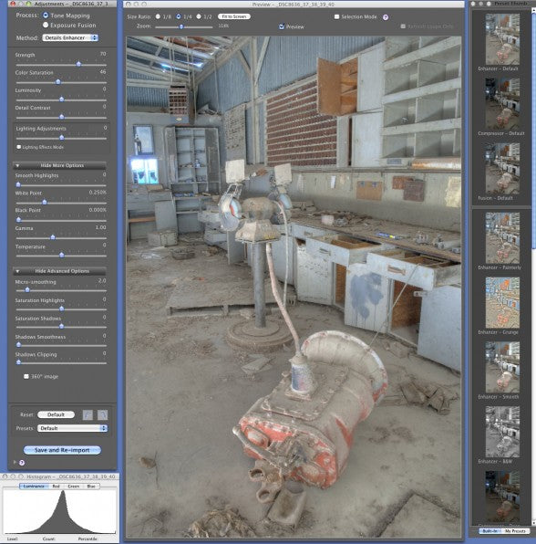
Although the image looks washed out and needs more color and contrast, the histogram shows that no areas are clipped in the shadows, but a tiny amount of highlight information is clipped. Overall, however, the entire tonal range can be seen. One of the first adjustments I make is to fix any clipping in the highlights or shadows by adjusting the white and black points. If you are unable to do this, you probably need to add more bracketed shots by going back and re-exporting the image files. Hopefully you took enough to afford this option.
Next, I bump up the Strength to 90-100% when faced with scenes that are shot indoors and detail-rich such as this one. Please note that if this was a scene shot outdoors with a clear blue sky (bald sky with no clouds), I would set the strength much lower to around 60-70% or less, depending on whether halos are present. The strength slider controls the strength of the entire tone mapping process and global detail. It darkens the image as you move it to the right and makes it appear less natural. For a more photorealistic look and to reduce halos and grain, move it to the left. I prefer to change the color saturation and temperature in Lightroom, so I leave those two sliders alone. Because I want to bring out all the textures in the piece of equipment in the foreground and overall grittiness of the scene, I increase the Detail Contrast to around 6, which affects local fine detail enhancement. (Note that this slider used to be named Micro-contrast.) The luminosity slider controls overall brightness and contrast, but mainly affects the shadows and midtones. This slider is useful to pull out shadow details by increasing brightness. Here I have it set for around 8. I prefer to use the luminosity slider to pull more details out of the shadows rather than the Gamma slider.
The most important slider is under Lighting Adjustments, which used to be called Light Smoothing. You can choose to check the Lighting Effects box (as I have here for demonstration purposes), which reveals five different settings from extra surreal to extra natural. I usually keep the box unchecked and just use the numerical slider. Keep in mind that the further the slider is to the right (or when choosing Natural +), the more realistic the image will look with fewer resulting halos. Dragging it all the way to the left (or when choosing Surreal +) creates the so-called Harry Potter look, along with wild, psychedelic colors, lots of halos, and noise.
HDR A-GO-GO
Note that HDR processing can produce strong greens and oranges. In fact, the greens often look lime-like and the oranges very surreal like radiation sickness. This can be minimized by moving the Lighting Adjustments slider towards the right for a more natural look. It can also be fixed later with Hue/Saturation/Luminance adjustments. However, it is interesting that Epson’s newest x900 series of printers with so-called ‘HDR’ inks now have dedicated green and orange inks, totaling 10 colors. Most likely this decision was made because Epson’s newer line of printers can extend into the ProPhoto RGB space, thus the addition of green and orange inks to the mix.
Moving down, I almost always choose to bump up the Smooth Highlights slider a bit to reduce noise in the sky, since I am using a smaller, cropped sensor (DX format). Moving this slider to the right will also help minimize halos as well. Remember, any slider that is named smoothing has a tempering effect upon details enhancement, and can reduce halos, chromatic aberrations, noise, and other artifacts.
I have already discussed the white and black points: move these sliders to the right or left to brighten or darken the image. Just be sure there is no clipping in the histogram. These sliders help make sure there is an absolute white and pure or deep enough black in the image. Below these lie the Gamma slider, which works much the same as in Photoshop. Moving the slider left or right affects the brightness without clipping the highlights or shadows. Use this in conjunction with the Luminosity slider.
Finally, I almost always bump up the Micro-smoothing slider, which tempers some of the fine detail on a small scale. In particular, this affects the highlights and shadows, thereby reducing noise. Note that this slider works in combination with the Detail Contrast slider (formerly called Micro-Contrast), so if I have that slider set to a high amount, I pull it back a bit with Micro-smoothing.

We are now finished with the tone mapping process, and can click on the Save and Re-import button at the bottom. Note that if you want to save your settings as a preset to use again, click on the Presets drop-down menu and save it for future use. The settings are saved as XMP sidecar files. Here is what the image looks like after tone mapping in Photomatix:

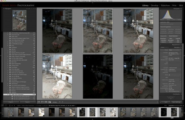
And here is what it looks like in Lightroom (outlined in white) next to the five original Raw files:
Although the image is improved and contains a nice tonal range, it still lacks contrast and snap. And our work is only half done. The usual spotting, noise reduction, cloning, temperature adjustments, perspective correction, cropping, and other tasks need to be done in Lightroom, Camera Raw or Photoshop before we begin the post-processing work that will set our images apart from the pack. Stylization of your images is a must in today’s competitive environment, and will make a huge difference in the quality of your prints. Here is my final image of the abandoned machine shop after post-processing and stylizing. First, a side-by-side view in Lightroom of the Photomatix tone mapped image and the final stylized image:

Next, the final processed image by itself. What a huge difference stylization makes!

Equipment Failure ©Renee Besta
Get Your Style On
The final important step in producing an HDR image for print is, in my opinion, the most fun and rewarding. That step is stylizing your image to bring out its mood and feel and set it apart, so don’t stop now. Today there is a bounty of plug-in software available that works in conjunction with Lightroom, Photoshop, and Aperture to accomplish this task. Some of the most popular plug-ins are made by onOne Software, Nik Software, and Topaz Labs and include PhotoTools, Color Efex Pro, Topaz Adjust, and Topaz Detail. In my example above of the old machine shop, I used PhotoTools 2.6 by onOne. There are literally tons of tutorials, webinars, and podcasts available on how to use these plug-ins. Note if you are a member of NAPP (National Association of Photoshop Professionals), you will receive discounts on these and other software products, including those from Adobe. In addition, many renowned photographers have software discounts available on their websites.
This was part two of the three part series on How to print HDR photographs. First was Camera Settings and Color Management and this was Monitors and Post-Processing. Next will be part three: Printing Tips — Prints that really pop.
want to learn more from Renee?
Former Central Coast Photographic Society President and digital imaging instructor Renée Besta will be teaching classes at Studios on the Park in downtown Paso Robles, located along the spectacular California Central Coast. This scenic area is the perfect location for photography, from windswept dunes to ocean vistas. The classes include Introduction to Fine Art Printing: How to Achieve Exhibition Quality Prints From Your Images, and Introduction to HDR (High Dynamic Range) Photography. The dates have not yet been finalized. For more information, contact Renée at rbesta@charter.net or visit http://renmarphoto.com and fill out the contact form.
