

Breaking down light values and how they can impact the emotion of an image.
Many first art lessons begin with a still life.
The instructor sets one up on a central table and positions a light in order to create some depth so students can begin to see and illustrate the five lights of nature upon 3-D objects as they create shape, proportion, color and form.
For many artists this is the extent of their training with light, but I was fortunate to have the additional opportunity to study photography from a true lighting Master. In this article I will share some of the important things he taught me about lighting for photography.
One of the first considerations when creating conscious art is the decision of what the overall value is going to be, and the range of values that might be contained within the piece. These two elements are powerful transmitters of emotion and help artists communicate what they want viewers to feel when looking at their work. In this article we’ll explore the fundamentals of value and value ranges and how they project emotion and eye control in paintings and photography.
It is no accident that many traditional art and photography courses begin with students learning how to work in black and white. This is because there is so much to learn and it’s important that new artists receive a clear base of knowledge to build upon. Eliminating color allows one to concentrate on composition, balance of masses, value and contrast, which are the essences of structure, depth, perspective and shape. It’s a lot for a beginner to learn without adding the equally vast exploration of color.
Color can distract one from seeing poor image construction but in gray scale images it is easy to see the places that are lopsided, too bright, too dark or lacking in important details. Ansel Adams used a value scale, Grayscale, that assigns gradient positions from 0 to 10, 0 being black and 10 being white.

Photoshop assigns gradient values, called Luminosity, from 0 to 255.

Images consisting of values that fit into the lower value ranges are called Low Key images. Low Key images attract people deeply. Words like somber, mysterious, perilous, moody, heavy, strong, glorious come to mind depending on what the subject matter is.


Dark images have the strongest impact when they contain rich blacks, good detail and fully saturated colors. These are good candidates for printing on paper or canvas that features a gloss or semi gloss surface because the characteristics of the paper surface enhance contrast and allow maximum viewing of details.
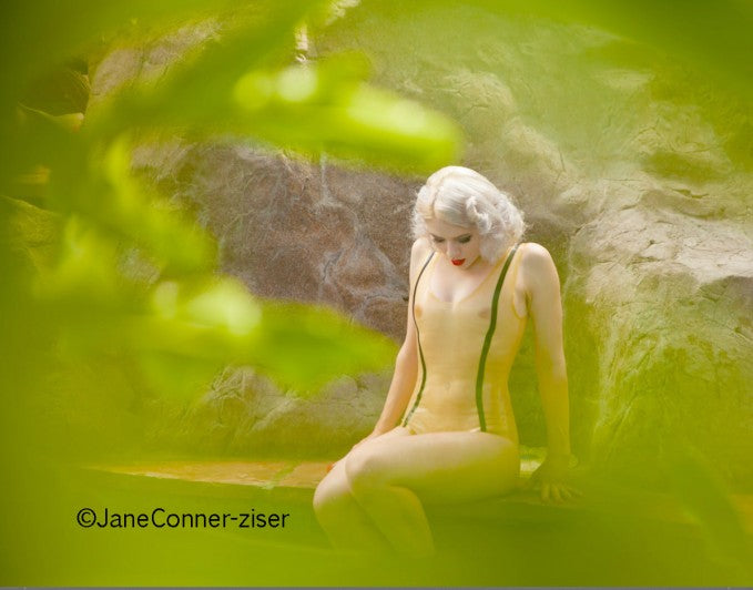
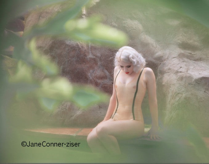
High Key, or light images make viewers feel light and airy. Words like joyful, free, sweet, delicate, innocent, fresh, new describe possible emotional responses to High Key images, again, influenced by the subject matter.


To enhance the soft emotion of pastel images, use semi matt to matt surfaced papers because dull surfaces diffuse contrast, weaken color saturation and mask details.
Here’s an idea of how media surfaces affect the way we see contrast, color and detail. My manipulation of the marble is done with Photoshop instead of sand paper but it illustrates the point pretty realistically.

Choice of surface texture can be used to enhance existing contrast, color and detail in images or correctively when you need to move an image in a different direction in order to tone it down or boost it up.
We’ve discussed Low Key images and High Key ones, but what about Mid Key? Mid Key images are neutral but they are open for experiences. They can go bright and dynamic or pastel and soft. Because mid key value doesn’t project much emotion on its own, artists must rely upon other elements, like subject matter, perspective, color and composition to elicit the desired emotional response.

In these samples, it’s easy to see how Mid Key images can be either bright or pastel, and since they print well on all surfaces, it’s just important to choose the one that enhances the subject and mood of the image.
Value also affects the way we see lighting and assigns importance to different lighting values in describing the shapes of objects within our imagery.

In high key images, the darkest values demand the most viewer attention. One might look at other things in the image, but want to keep going back to the darkest areas, the shaded sides and shadows. In mid key images, the diffused highlights become less significant that the specular highlights and shadows – both ends of the value scale become important design elements. Notice how important the highlights and reflected lights become in low key images. Professional artists use overall value as a palette upon which to draw the viewers eyes throughout the piece using the sculptural nature of light.
Here is a sample of how it works in a digital painting:

Enjoy how in the light painting, the shaded side of her face is supported gracefully by the pedestal shape of the shaded side of her gown. In the dark painting your eyes want to look at the delicate curvy line of light skimming up her arm to the highlight side of her face. In the mid key painting, you get a bit of both and since they are both on the subject and in higher detail on the face, it’s a successful directive of viewer attention to enjoy the pedestal shape of the gown, the flowing fabric and the delicate line directing one to the face.
It’s important to remember that much about art is subjective. What looks good to one person may not look good to another, but there’s also a lot of science and math in art. Mastering the science of how we see and respond to value, shape, line, contrast color and detail provides you with powerful avenues for expressing your emotions through media. Mastering the math on how to create lighting, object construction, composition, perspective and color gives you the building tools you need in order to construct your art with confidence.
Education in art is the difference between art and accidents!
Looking for the next step? I suggest downloading Breathing Color’s free eBook on printing HDR photographs for more on getting great images and printing them.

Jane Conner-ziser is an award winning photographer, digital artist, premier educator and independent consultant. With over 25 years of experience, 19 of them in digital imaging and evolving technologies, the techniques Jane developed for facial retouching and enhancement and portrait painting from photographs are widely emulated by photographers and digital artists worldwide through her classes, online training and educational products.
