by Breathing Color
on January 30, 2024
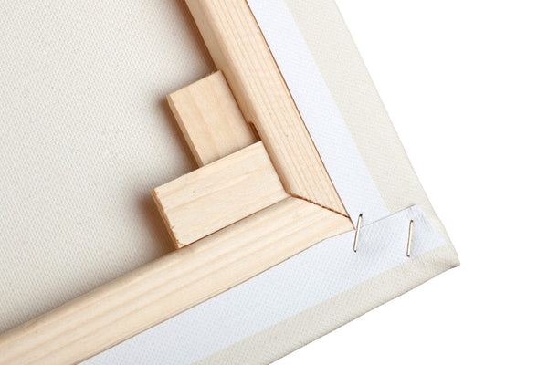
There are a variety of ways to stretch a canvas print. However, not every method...
by R. Carnie L
on January 24, 2024
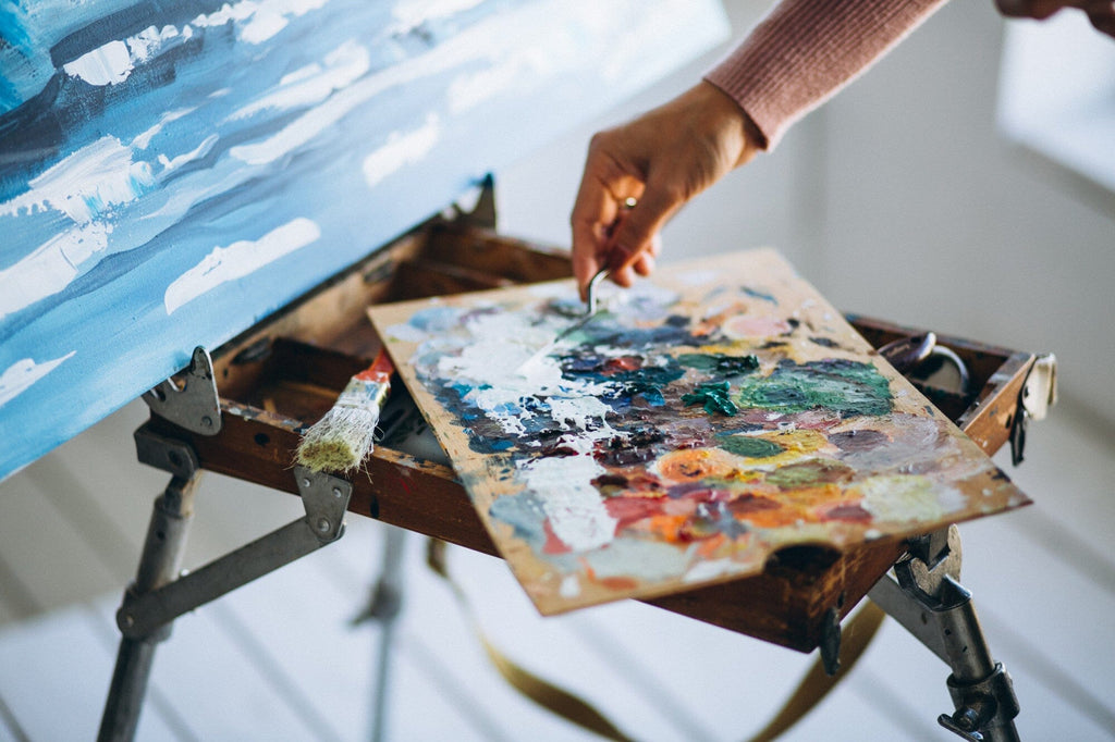
Art isn’t just about the art anymore Digital printmaking has ‘leveled the playing field’ as...
by Michael Flanagan
on January 24, 2024
First things first, let’s define our terms so we know what we’re talking about. Unfortunately,...
by R. Carnie L
on January 24, 2024
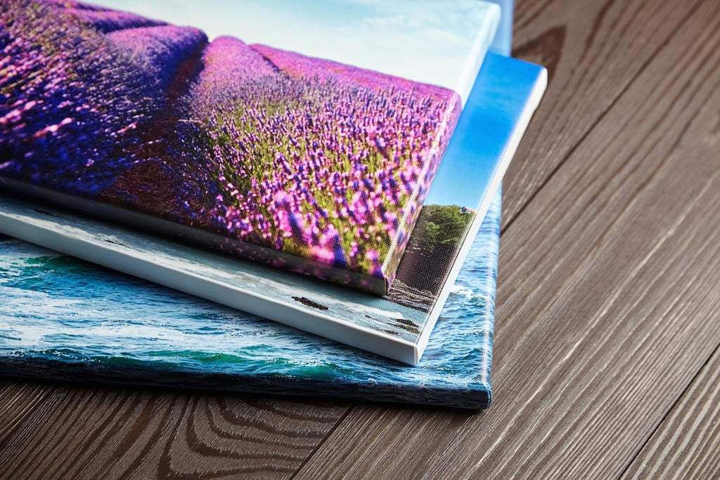
Fine art printing is an art form in itself. Digital printing solutions have changed the...
by Jesus Marquez
on January 24, 2024
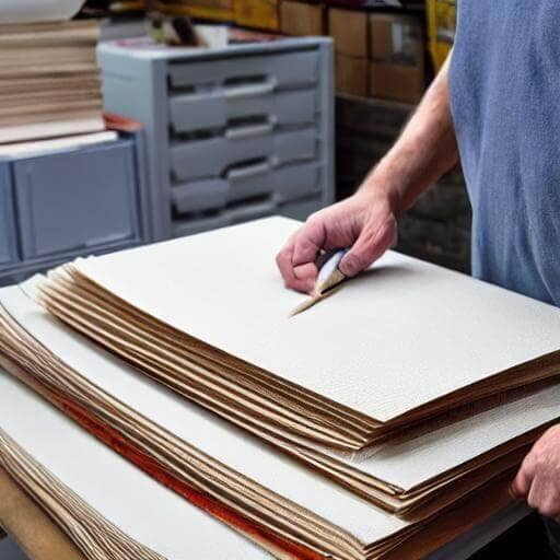
Canvas and paper have been staples in the fine art production and printing world since...
by Jesus Marquez
on January 11, 2024
The fine art printing industry has experienced a metamorphosis with the advent of digital technology...