

A lesson on basic color theory and mixing colors to match existing hues to repair or touch up prints.
The first step is to gather some supplies:
Try to use pigment that is the same as those used to create the image when possible. For color photographs, try to find liquid photo retouching dyes (Kodak’s were the best). If it’s a digital print, try to use the same inks as those in the printer. 3-D embellishments on canvas require different media, usually acrylics. Get a good set of pure primary and secondary colors, plus black, and if using opaque media, white.

Cut up some scraps of paper or canvas that are the same as the project image. These will be used to test the color mixes.
Distilled water is used to lighten dye and ink mixes; white lightens opaque colors.
Use the right brushes. Winsor Newton series 7 sable brushes are good choices for photographic dyes and printer inks (suggestion: the #2 size). Acrylics apply nicely with inexpensive bristle brushes (Grumbacher makes some nice ones).

It’s a good idea to reserve each brush for the purpose for which it was purchased. Use the dye brush for dye, the ink brush for ink and the acrylic brushes for acrylics.
Good quality facial tissues are used to blot dye and ink, plus prepare the sable brush for spotting. Paper towels are good for wiping excess acrylics off of bristle brushes.
Keep a small hair dryer on hand. Many colors turn darker or lighter when they dry. Some colors alter when sealed under protective coatings. When matching is critical test colors can be dried and coated to make sure they will remain exact throughout the finishing process.
In order to use color it is important to understand a little bit about how colors work. Let’s start with color wheels. There are a few color wheel systems based upon the primary colors of the media. A primary color is not a mixed color; it exists in its pure form. Early artists used to find their primary colors in nature, using plants and rocks that were ground up and bound together with water, milk or oil. Today artists buy them in bottles or tubes.
Here are a few color wheels to consider:

The primary colors for painters are marked with a P. The colors between them are created using equal amounts of their two primary neighbors. Let’s simplify this by using the color wheel for traditional art mediums:

Equal parts of Yellow and Blue make Green. Green is a secondary color. Equal parts of Yellow and Red make Orange. Equal parts of Blue and Red make purple. Orange and Purple are also secondary colors.
Color wheels grow outward from here. Equal parts of the primary and it’s secondary color create a third color, called a tertiary color, such as Red Orange, Yellow Orange, Yellow Green, Blue Green (Cyan), Blue Purple and Red Purple (Magenta).

Color wheels can keep growing and growing producing a rainbow of bright colors just by mixing adjoining colors together. However, in nature many colors are not so fully saturated. Dull colors are created by combining colors that are opposite each other on the color wheel. Opposite colors are called complimentary colors. Complimentary colors are called this because we only see color in relation to other colors. Viewing a color next to its compliment, for instance blue next to orange, makes each of them appear brighter than they do when viewed next to other colors, for instance blue next to purple. Let’s view the colors in different ways:
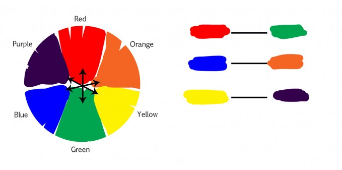
Here we are viewing primary and secondary colors as they relate to each other in a circle and also as they relate to each other linearly. (In Photoshop, if you choose Image/Adjust/ColorBalance the window that opens shows Photoshop’s primary and secondary colors in a linear way as adjustable sliders. Notice that cancellation of of cyan saturation is accomplished by adding red. On computers red makes cyan duller. Cyan makes red duller.)

Combining complimentary colors ultimately produce Brown. The shade of brown created is determined by which complimentary set is being used and what percentage of each color is used in the mix. For instance, a Red / Green mix can produce browns that range from brick red to sepia green depending on the quantity of each color in the mix. This is what it looks like when complimentary colors are combined.

Notice that there are a lot of color and shade differences depending on the mix ratio. It’s easy to mix a brown to match any shade using the right complimentary colors – the trick is choosing the right set to start with because brown is so dull that it’s sometimes hard to name a primary or secondary color to use as the mix base.
White is considered to be the absence of color. It is used to lighten opaque mediums. Water is used to lighten transparent mediums.
Black is considered to be “all” colors and because all colors are created from the three primary colors, pure black is a combination of equal parts of the three primary colors. Many artists choose to purchase premixed black pigment because the inconsistency of raw colors usually results in the artist having to visually adjust the black; it’s not perfect math.
We’ve just covered the three elements that all colors have in common, Hue, Saturation and Value.
Hue is the name of the color, like yellow, orange, green etc.
Saturation is how bright or dull the color is, like scarlet red or brick brown.
Value is the color’s relationship to white and black, like light, medium or dark.
This makes mixing colors easy! The method outlined here is the simplest I’ve found. It is fast, consistent and makes mixing colors to match exactly a breeze. Here’s how it works:
The first step is to identify exactly what hue to start with. Look at the area to be worked on and name the color. Choose a primary or secondary color. As mentioned earlier, sometimes it’s difficult to name a color but one has to start with something so it has to be done. If it’s difficult to decide the color, try placing an 18% gray card with a hole cut out of the middle over the area in which you want to work. It will eliminate the surrounding colors and will make the decision easier.

In this instance, the choice of Hue is Red. Place a bit of the Hue on the edge of a scrap piece of paper or canvas. Dry the pigment with the hair dryer, apply coating if needed and then hold it right next to the area you want to work in. If the pure color is too dark add some water or white until it’s close enough to work with.

Next, adjust the saturation of the color by adding small amounts of the complimentary color and making new tests on the scrap paper. In this instance, the pure red color, diluted, almost matches the area that needs work, but it is too bright. In order to make the pure red less saturated, a small amount of green is added. A new test mix shows that the color is getting closer.

Next it’s time to adjust the value. If the color is too dark, add more water or white. If the color is too light, add some black and test again. In this instance, it’s pretty close.
A quick Hue, Saturation and Value mix often provides a perfect match, but sometimes a final adjustment is required to make it exact. This time the color is almost perfect, but if we want to be picky, the color in the image is a little warmer than the sample color on the white paper. This means that the color mix needs a tiny touch of yellow. It is important to name the color as a primary or secondary color again. “Warmer” could mean red, orange or yellow – since we started with red, we could add either orange or yellow, but because orange is a 50/50 mix of red and yellow, we’ll get there faster by using yellow.

The color mix may now be used to spot, repair or embellish with confidence!

It’s safe to say that almost every color can be created using two colors, with perhaps a third to make it exact, plus the addition of white (water) or black if the color must be lighter or darker.
This method of mixing colors is pure and simple but many professional artists use the same principles to alter previous mixes to use in different locations in the painting. The color mixes kind of grow together and create visual color harmony in the art. Because human beings have unique perceptions and preferences in color, two artists painting the same subject may end up with palettes that look very different. This is considered part of the artists’ style.
Color is a huge subject but it’s been my experience that basic color theory and the simple 3-4 step process for mixing colors that I’ve outlined in the article will never let you down. You can exactly match any color you desire for spotting, repair or adding 3-D paint on top of digitally produced paintings with ease and confidence.

Jane Conner-ziser is an award winning photographer, digital artist, premier educator and independent consultant. With over 25 years of experience, 19 of them in digital imaging and evolving technologies, the techniques Jane developed for facial retouching and enhancement and portrait painting from photographs are widely emulated by photographers and digital artists worldwide through her classes, online training and educational products.
